How to Use Dynamic Viewports and Relative Units in Framer
Framer Tutorials
13 may 2025
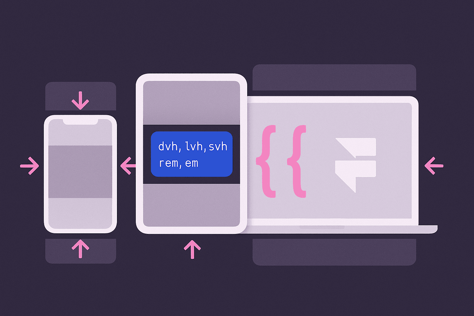
Understanding Dynamic Viewports and Relative Units in Framer
Recently, while working on a project, I encountered an issue that many Framer users might face — I needed to use dynamic viewport units like dvh and relative units like rem and em, but realized that Framer doesn’t natively support them yet. After a bit of trial and error, I found a practical workaround that I’m excited to share with you. If you’ve run into the same limitations, this guide will help you implement these powerful units in your own projects.
Framer is an incredibly powerful tool for building responsive websites and prototypes. But if you've ever tried to use dynamic sizing options like dvh, lvh, or relative units like rem and em, you might have noticed that Framer doesn't natively support them yet.
Good news: with a clever workaround, you can start using these units today and make your designs even more adaptable across devices.
Why Dynamic Viewport Units Matter
On mobile devices, the viewport size isn't fixed. Toolbars can appear or disappear as users interact with your site, causing the visible area to change. Traditional units like vh (viewport height) don’t adjust dynamically when these toolbars show or hide, leading to awkward layout issues.
For example:
An element set to
100vhmight be too tall when browser toolbars are visible.That same
100vhelement might fit perfectly when toolbars are hidden.
This inconsistency is exactly why dynamic viewport units were introduced:
dv*: Dynamic viewport (adjusts depending on toolbar visibility)
sv*: Small viewport (toolbar expanded)
lv*: Large viewport (toolbar retracted)
By using units like 100dvh instead of 100vh, you ensure your layouts stay consistent no matter what.
How to Implement Dynamic Viewports and Relative Units in Framer
While Framer doesn’t offer these units natively, there’s a practical solution using Custom Code Overrides.
Here’s the simple process:
1. Access the Remix Project
First, access the remix project associated with this workaround. (If you don't have it yet, let me know, and I'll help you find a trusted version.)
2. Create a New Custom Code Override
In your Framer project:
Create a new custom code file named DynamicAndRelativeUnits.tsx.
Copy and paste the provided code from the remix project into this file.
3. Apply the withDynamicAndRelativeUnits Function
This function enables your elements to use custom dynamic sizing. Apply it to any element you want to size with dynamic viewport or relative units.
4. Rename Elements to Define Sizes
The magic happens through the naming convention. Rename your layers following this format:
For height:
height:[value][unit]For width:
width:[value][unit]For both:
height:[value][unit]|width:[value][unit]
Examples:
height:100dvh→ Height 100 dynamic viewport height.width:50rem→ Width 50 root em units.height:100dvh|width:50vw→ Both custom height and width.
When you preview your page, the elements will dynamically adjust based on the custom units you've assigned.
Supported Units
This method supports a wide range of dynamic and relative units:
Dynamic viewport units: dvh, dvw, dvmin, dvmax
Small viewport units: svh, svw, svmin, svmax
Large viewport units: lvh, lvw, lvmin, lvmax
Relative units: rem, em
Final Thoughts
While we wait for official support in Framer, this method gives you full control over responsive behavior using dynamic viewports and relative units. By applying a simple override and following a consistent naming convention, you can ensure your designs work beautifully across all devices and screen configurations.
And if you’re ready to take your design to the next level, Aquila Design is here to help. Reach out to us today to see how we can transform your project!
Detrás de los Frames
Mi nombre es Agustin, pero la gente me llama Acu. Soy el diseñador y desarrollador con el que realmente estarás trabajando. Comencé Aquila para ayudar a las empresas de servicios a aparecer en línea con claridad y confianza.

Has trabajado duro para construir tu negocio
— Sirviendo a los clientes, perfeccionando tu oficio y haciendo crecer tu reputación.
Pero ahora es tiempo de
un sitio web que trabaja tan duro como tú.
Envía un mensaje rápido