How to Make a Responsive Website Using Framer
Framer Tutorials
Jan 29, 2025
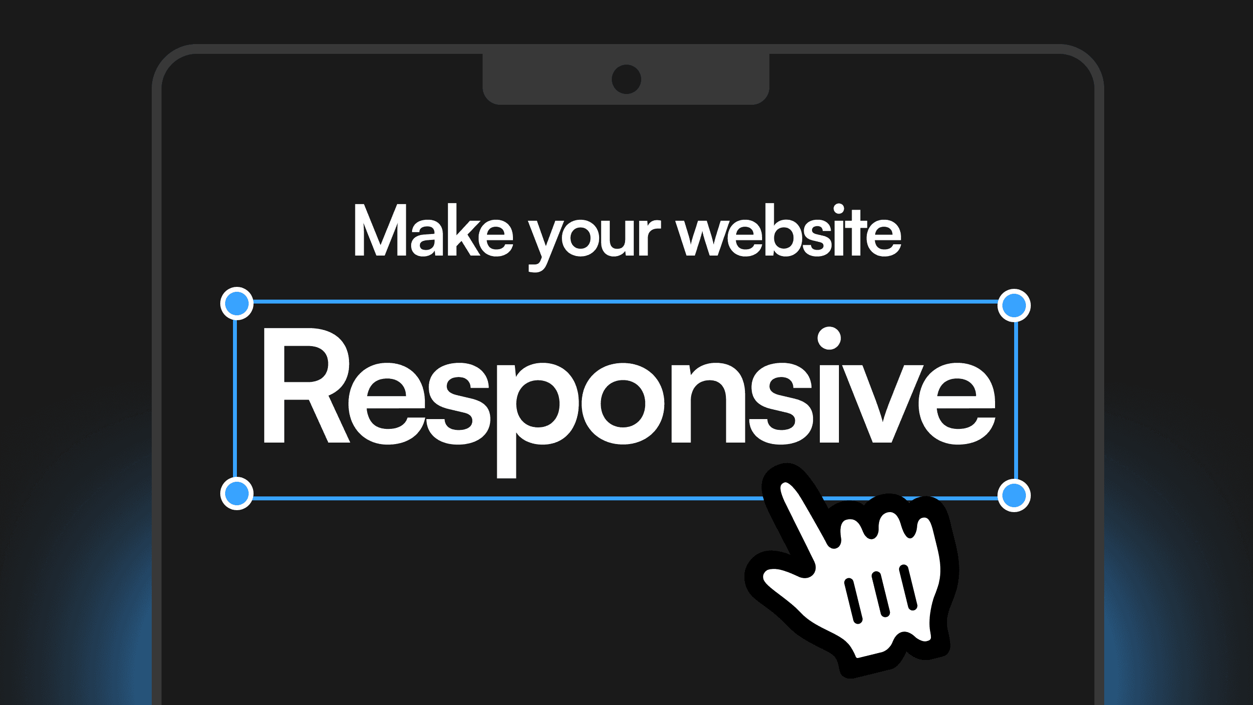
Why Responsive Design Matters in Framer
Building a responsive website ensures that your site looks and functions perfectly on all screen sizes, from desktops to mobile devices. With Framer, you can create fluid designs by using relative positioning, stacks, grids, and breakpoints instead of relying on fixed layouts.
Always Use Relative Positioning
When designing in Framer, relative positioning should be your default choice. This means setting elements to auto, relative, or percentage-based positioning, allowing them to adapt naturally to different screen sizes.
Absolute positioning should only be used when necessary, such as for decorative elements that need to stay in a fixed place relative to another element. Overusing absolute positioning can lead to layout breakage on different screen sizes.
Use Stacks and Grids Over Frames
Framer offers Stacks and Grids, which make creating flexible layouts easier.
Stacks automatically distribute spacing between elements and adjust as content changes. Grids allow you to create structured layouts that rearrange elements automatically for different screen sizes.
Avoid using separate frames for layout control since they require more manual adjustments and don’t scale as easily.
Use Text Styles for Automatic Responsiveness
In Framer, text should be set using text styles rather than fixed sizes. This ensures that text scales properly across breakpoints.
By defining text styles, you can apply automatic font size adjustments per breakpoint, making the text readable on every device without manually resizing it for each screen.
Leverage Component Variants for Different Screens
Using component variants in Framer allows you to create adaptable UI elements that change based on screen size. Instead of designing separate components for mobile, tablet, and desktop, variants let you create one flexible component that adjusts as needed.
For example, you can create a navigation bar variant that switches from a full menu on desktop to a hamburger menu on mobile without rebuilding it from scratch.
Set Breakpoints for Tablet, Phone, and Large Screens
To ensure full responsiveness, always define breakpoints for:
• Tablet (768px and above)
• Phone (375px and above)
• Large Desktop (1440px and above, if necessary)
Breakpoints allow you to adjust layouts, font sizes, and spacing dynamically to create an optimized experience for every device.
Creating a responsive website in Framer is easy when you use relative positioning, stacks, grids, component variants, and breakpoints. By following these best practices, your site will be visually appealing and function seamlessly across all devices.
And if you’re ready to take your design to the next level, Aquila Design is here to help. Reach out to us today to see how we can transform your project!
Behind the frames
My name is Agustin, but people call me Acu. I'm the designer & developer, who you’ll actually be working with. I started Aquila to help service-based businesses show up online with clarity and confidence.

You’ve worked hard to build your business
— Serving clients, perfecting your craft, and growing your reputation.
But now it’s time for
a website that works as hard as you do.
Send a Quick Message