Español
How to Password Protect Individual Pages on Framer
How to Password Protect Individual Pages on Framer
Consejos de Framer
29 ago 2024
How to Password Protect Individual Pages on Framer
Add a new code override and give it a name.
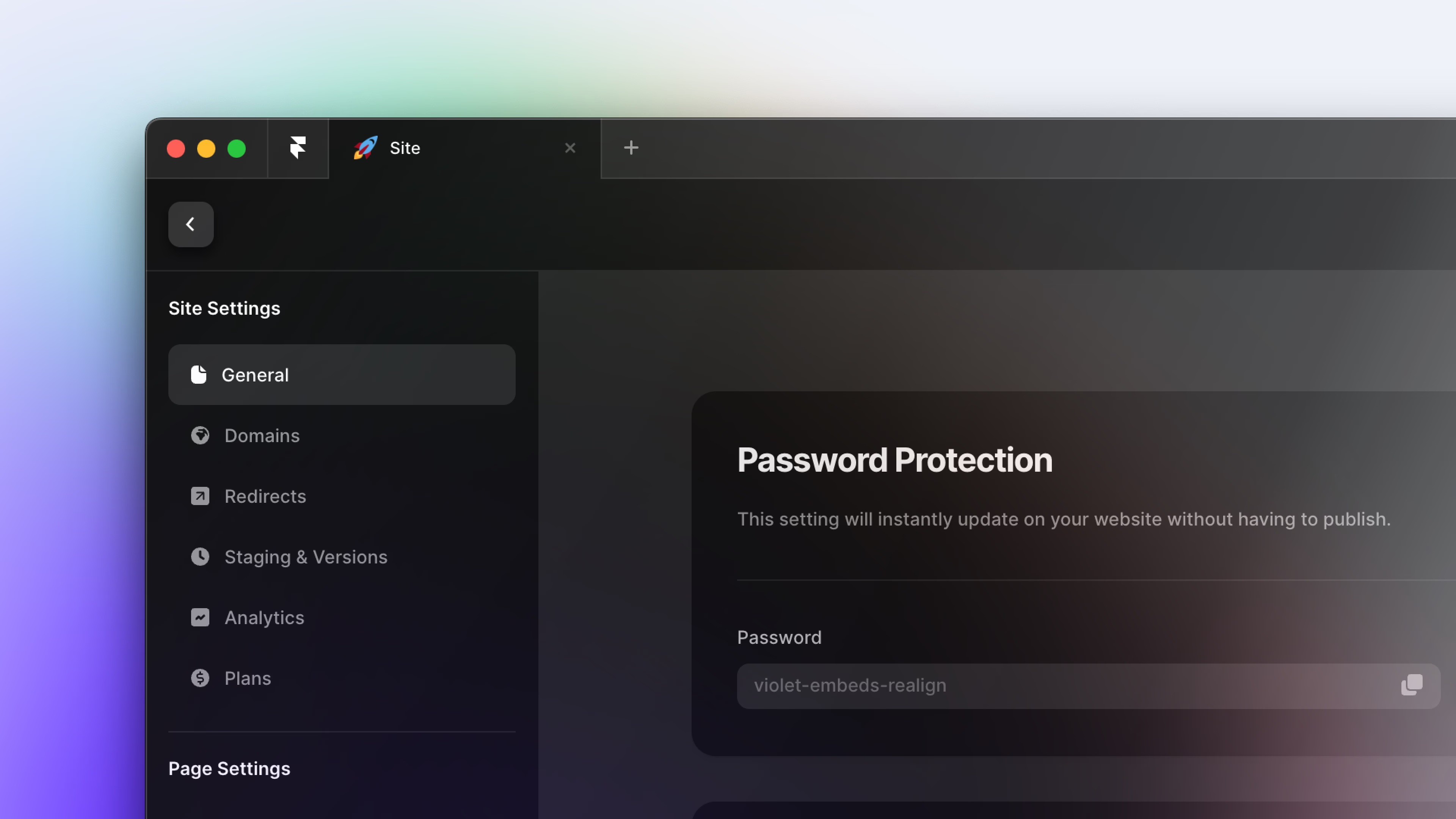
On the left sidebar pane, Go to "Assets" tab
Click (+) to add a new code file
Name the code file
Auth.tsxSelect file type as "New Override"
Click "Create"
Delete the sample code in the new file
Copy and paste the provided code into the
Auth.tsxfile.
import React, { useState, useEffect, useRef } from "react"
import type { ComponentType } from "react"
import { addPropertyControls, ControlType } from "framer"
import {
    Eye,
    EyeSlash,
    LockSimple,
    LockSimpleOpen,
    ArrowUUpLeft,
} from "phosphor-react"

// ===== CUSTOMIZATION SECTION =====
// Edit this section to customize the password protection

// Add or remove passwords here (case-sensitive)
const ALLOWED_PASSWORDS = ["ABCD", "abcd", "Abcd"]


// Customize the text content here
const TEXT_CONTENT = {
    title: "PRIVATE CONTENT",
    subtitle: "Enter passcode to continue (passcode: abcd)",
    errorMessage: "Incorrect passcode. Please try again.",
    buttonText: "Unlock",
    returnButtonText: "Return to Projects",
}

// Change this URL to where you want users to return when clicking the link to return
const RETURN_URL = "https://www.google.com"

// Customize the design here
const STYLE_TOKENS = {
    colors: {
        background: "#FFFFFF", // Background Color
        text: "#000000", // Main text color
        primary: "#000000", // Color for buttons and important elements
        secondaryText: "#605D64", // Color for less important text
        buttonText: "#FFFFFF", // Color for the button text
        error: "#D8512A", // Color for error messages and error input border
        inputBorder: "#CCCCCC", // Default border color for input fields
        inputBorderFocus: "#000000", // Border color when input is focused
        inputBorderError: "#D8512A", // Border color when there's an error
        buttonHover: "#333333", // Button color on hover
        linkHover: "#333333", // Home link color on hover
    },
    fonts: {
        heading: "Syncopate, sans-serif", // Font for headings
        body: "General Sans, sans-serif", // Font for body text
        button: "General Sans, sans-serif", // Font for button text
    },
    fontSizes: {
        title: "clamp(1.25rem, 1.586vw + 1.151rem, 2rem)", // Responsive title size
        paragraph: "18px",
        input: "16px",
        button: "16px",
        small: "14px",
    },
    fontWeights: {
        normal: "500",
        medium: "600",
        bold: "800",
    },
    spacing: {
        xs: "4px",
        sm: "8px",
        md: "12px",
        lg: "24px",
        xl: "32px",
        xxl: "48px",
    },
    borderRadius: {
        small: "8px",
    },
    container: {
        maxWidth: "400px",
    },
}
// ===== END OF CUSTOMIZATION SECTION =====

const styles = {
    container: {
        display: "flex",
        flexDirection: "column",
        alignItems: "center",
        justifyContent: "center",
        minHeight: "100vh",
        backgroundColor: STYLE_TOKENS.colors.background,
        fontFamily: STYLE_TOKENS.fonts.body,
        color: STYLE_TOKENS.colors.text,
        padding: STYLE_TOKENS.spacing.md,
    },
    header: {
        marginBottom: STYLE_TOKENS.spacing.lg,
        textAlign: "center",
    },
    title: {
        fontSize: STYLE_TOKENS.fontSizes.title,
        fontWeight: STYLE_TOKENS.fontWeights.bold,
        fontFamily: STYLE_TOKENS.fonts.heading,
        lineHeight: "125%",
        marginBottom: STYLE_TOKENS.spacing.xs,
    },
    subtitle: {
        fontFamily: STYLE_TOKENS.fonts.body,
        fontWeight: STYLE_TOKENS.fontWeights.normal,
        fontSize: STYLE_TOKENS.fontSizes.paragraph,
        lineHeight: "150%",
        margin: "0px",
        color: STYLE_TOKENS.colors.secondaryText,
    },
    form: {
        width: "100%",
        maxWidth: STYLE_TOKENS.container.maxWidth,
    },
    inputContainer: {
        position: "relative",
    },
    input: {
        width: "100%",
        fontFamily: STYLE_TOKENS.fonts.body,
        fontSize: STYLE_TOKENS.fontSizes.paragraph,
        fontWeight: STYLE_TOKENS.fontWeights.normal,
        paddingTop: STYLE_TOKENS.spacing.md,
        paddingBottom: STYLE_TOKENS.spacing.md,
        paddingLeft: STYLE_TOKENS.spacing.md,
        paddingRight: STYLE_TOKENS.spacing.xxl,
        fontSize: STYLE_TOKENS.fontSizes.input,
        border: `1px solid ${STYLE_TOKENS.colors.inputBorder}`,
        borderRadius: STYLE_TOKENS.borderRadius.small,
        outline: "none",
        transition: "border-color 0.3s",
        WebkitAppearance: "none",
        MozAppearance: "none",
        appearance: "none",
    },
    inputError: {
        borderColor: STYLE_TOKENS.colors.inputBorderError,
    },
    showPasswordButton: {
        position: "absolute",
        right: STYLE_TOKENS.spacing.md,
        top: "50%",
        transform: "translateY(-50%)",
        background: "none",
        border: "none",
        cursor: "pointer",
        padding: "0",
    },
    button: {
        width: "100%",
        padding: STYLE_TOKENS.spacing.md,
        marginTop: STYLE_TOKENS.spacing.lg,
        fontFamily: STYLE_TOKENS.fonts.button,
        fontSize: STYLE_TOKENS.fontSizes.button,
        fontWeight: STYLE_TOKENS.fontWeights.medium,
        color: STYLE_TOKENS.colors.buttonText,
        backgroundColor: STYLE_TOKENS.colors.primary,
        border: "none",
        borderRadius: STYLE_TOKENS.borderRadius.small,
        cursor: "pointer",
        transition: "background-color 0.3s",
        display: "flex",
        alignItems: "center",
        justifyContent: "center",
    },
    buttonHovered: {
        backgroundColor: STYLE_TOKENS.colors.buttonHover,
    },
    error: {
        color: STYLE_TOKENS.colors.error,
        marginTop: STYLE_TOKENS.spacing.md,
        fontSize: STYLE_TOKENS.fontSizes.small,
    },
    returnLink: {
        marginTop: STYLE_TOKENS.spacing.xxl,
        color: STYLE_TOKENS.colors.text,
        textDecoration: "none",
        fontSize: STYLE_TOKENS.fontSizes.small,
        display: "flex",
        alignItems: "center",
    },
    returnLinkHovered: {
        color: STYLE_TOKENS.colors.linkHover,
    },
}

export function requireAuth(Component): ComponentType {
    return (props) => {
        const [authenticated, setAuthenticated] = useState(false)
        const [showPassword, setShowPassword] = useState(false)
        const [errorMessage, setErrorMessage] = useState("")
        const passwordRef = useRef(null)
        const [loading, setLoading] = useState(true)
        const [hovered, setHovered] = useState(false)

        const validateAuth = (e) => {
            e.preventDefault() // Prevent default form submission behavior
            const inputPassword = e.target.elements.password.value

            if (ALLOWED_PASSWORDS.includes(inputPassword)) {
                setAuthenticated(true) // Set authenticated state to true
                setErrorMessage("") // Clear any existing error message
            } else {
                setAuthenticated(false) // Ensure authenticated state is false
                setErrorMessage(TEXT_CONTENT.errorMessage) // Set error message for invalid password
            }

            // Optionally clear the password field after submission
            e.target.elements.password.value = ""
        }

        useEffect(() => {
            if (passwordRef.current) {
                passwordRef.current.focus()
            }
            setTimeout(() => setLoading(false), 1000)
        }, [])

        if (!authenticated) {
            return (
                <div style={styles.container}>
                    <div style={styles.header}>
                        <h1 style={styles.title}>{TEXT_CONTENT.title}</h1>
                        <p style={styles.subtitle}>{TEXT_CONTENT.subtitle}</p>
                    </div>
                    <form onSubmit={validateAuth} style={styles.form}>
                        <div style={styles.inputContainer}>
                            <input
                                type={showPassword ? "text" : "password"}
                                name="password"
                                ref={passwordRef}
                                style={{
                                    ...styles.input,
                                    ...(errorMessage ? styles.inputError : {}),
                                }}
                                onFocus={(e) =>
                                    (e.target.style.borderColor =
                                        STYLE_TOKENS.colors.inputBorderFocus)
                                }
                                onBlur={(e) =>
                                    (e.target.style.borderColor = errorMessage
                                        ? STYLE_TOKENS.colors.inputBorderError
                                        : STYLE_TOKENS.colors.inputBorder)
                                }
                                autoComplete="new-password"
                            />
                            <button
                                type="button"
                                onClick={() => setShowPassword(!showPassword)}
                                style={styles.showPasswordButton}
                            >
                                {showPassword ? (
                                    <EyeSlash
                                        size={20}
                                        color={
                                            STYLE_TOKENS.colors.secondaryText
                                        }
                                    />
                                ) : (
                                    <Eye
                                        size={20}
                                        color={
                                            STYLE_TOKENS.colors.secondaryText
                                        }
                                    />
                                )}
                            </button>
                        </div>
                        {errorMessage && (
                            <p style={styles.error}>{errorMessage}</p>
                        )}
                        <button
                            type="submit"
                            style={{
                                ...styles.button,
                                ...(hovered ? styles.buttonHovered : {}),
                            }}
                            onMouseEnter={() => setHovered(true)}
                            onMouseLeave={() => setHovered(false)}
                        >
                            {hovered ? (
                                <LockSimpleOpen size={20} />
                            ) : (
                                <LockSimple size={20} />
                            )}
                            <span
                                style={{
                                    marginLeft: STYLE_TOKENS.spacing.sm,
                                }}
                            >
                                {TEXT_CONTENT.buttonText}
                            </span>
                        </button>
                    </form>
                    <a
                        href={RETURN_URL}
                        style={styles.returnLink}
                        onMouseEnter={(e) =>
                            (e.currentTarget.style.color =
                                STYLE_TOKENS.colors.linkHover)
                        }
                        onMouseOut={(e) =>
                            (e.currentTarget.style.color =
                                STYLE_TOKENS.colors.text)
                        }
                    >
                        <ArrowUUpLeft
                            size={16}
                            style={{ marginRight: STYLE_TOKENS.spacing.sm }}
                        />
                        {TEXT_CONTENT.returnButtonText}
                    </a>
                </div>
            )
        }

        return <Component {...props} />
    }
}

// Add property controls (if needed)
addPropertyControls(requireAuth, {
    // Add your property controls here
})
Personalize the design and copy
Change the values of the design tokens: ALLOWED_PASSWORDS, TEXT_CONTENT, RETURN_URL, STYLE_TOKENS to fit your brand.
Save code override file
Press CMD + S on Mac or CTRL + S on Windows to save
Extra
You can set multiple passwords that will work across all pages using this code override. Simply edit the ALLOWED_PASSWORDS list. For example:
const ALLOWED_PASSWORDS = ["myPassword123", "letMeIn", "secretCode"]Note: If you want different passwords for separate pages, you'll need to duplicate the "Auth.tsx" file, change the passwords in each copy, and apply the appropriate code override to each page.