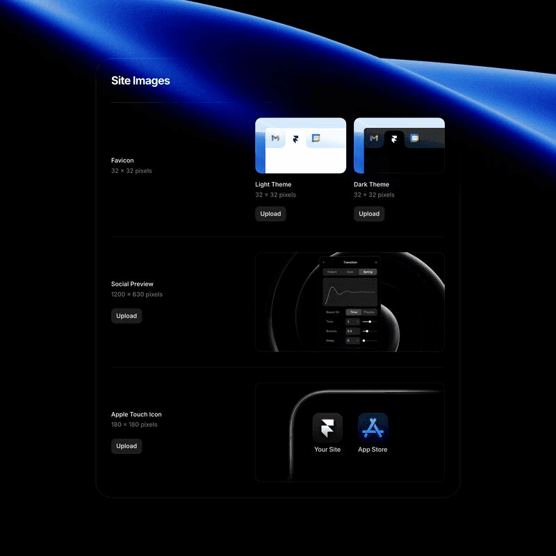
How to set a Light/Dark Theme Favicon In Framer
Framer Tutorials
Sep 24, 2024


Framer recently introduced an exciting feature: the ability to set two separate favicons based on the user’s preferred theme. This enhancement allows you to offer a more customized and accessible browsing experience, ensuring your website’s visual identity adapts to both light and dark modes seamlessly.
Why Setting a Dual Favicon Matters
The favicon is a small but crucial element in your web design. It not only represents your brand in browser tabs, bookmarks, and shortcuts, but also plays a role in user experience and website accessibility. With more users opting for dark mode on their devices, providing a favicon that adapts accordingly enhances readability and ensures consistency across different environments.
Benefits of Using a Dual-Theme Favicon in Framer
Improved Brand Consistency
Ensure your logo or symbol stands out, whether your users are browsing in light or dark mode.
Accessibility
Enhance user experience for those who prefer dark themes, avoiding a stark contrast from a light-themed favicon in dark environments.
SEO Advantages
An adaptable favicon contributes to a modern, user-friendly site, which search engines take into account when ranking pages.
Step-by-Step Guide to Setting Up a Light/Dark Favicon in Framer
1. Prepare Your Icons:
Icon Size: 32x32 pixels
• Create two versions of your favicon: one for light themes and one for dark themes. Ensure that the icons have transparent backgrounds to seamlessly blend into both environments.
2. Upload Favicons in Framer:
• In Framer, go to the project settings. You’ll see the option to upload separate favicons for light and dark themes. Upload your light favicon for users with a light theme and your dark favicon for users who prefer a dark theme.
3. Implement the Favicon:
• Framer makes it easy to implement both favicons using code. You’ll need to add custom code in the <head> section of your project to detect the user’s theme and display the appropriate favicon. Framer’s intuitive interface allows you to handle this without digging too deep into coding.
4. Test Across Devices:
• Before publishing, preview your site in both light and dark modes across various devices and browsers to ensure your favicon displays correctly and complements your design.
Why Framer Is the Ideal Tool for Modern Web Design
Framer’s no-code platform makes it incredibly easy to design a fully responsive website with innovative features like dual-theme favicons. For designers and developers looking to create accessible, modern websites, Framer is a game-changer. Not only does it streamline the design process, but it also supports essential tools like theme detection, responsive layouts, and now, dual-theme favicons.
By incorporating this tutorial into your workflow, you’ll ensure your site is up-to-date with the latest web design standards. At Aquila Design, we specialize in helping brands stand out through thoughtful, accessible, and user-centric web design. Whether you’re looking to redesign your site or optimize it with features like theme-specific favicons, we can help bring your vision to life.
Get in Touch
Need help implementing dual-theme favicons in Framer? Or looking for a complete website redesign to enhance your brand’s digital presence? At Aquila Design, we offer expert web design and development services tailored to your business needs. Reach out today to learn more!
Behind the frames
My name is Agustin, but people call me Acu. I'm the designer & developer, who you’ll actually be working with. I started Aquila to help service-based businesses show up online with clarity and confidence.


You’ve worked hard to build your business
— Serving clients, perfecting your craft, and growing your reputation.
But now it’s time for
a website that works as hard as you do.
Send a Quick Message